Ancestry App Update
Bringing the DNA and Family History apps back into one visual and strategic system — with a phased roadmap to get there without whiplash.
- ROLE
- Lead — mobile strategy
- TIMELINE
- 2021–2024
- PLATFORMS
- iOS · Android
- COMPANY
- Ancestry
At a glance
- Role: Lead — mobile strategy
- Timeline: 2021–2024
- Platforms: iOS · Android
- Context: Ancestry’s Family History and DNA apps had drifted apart
The problem
For a stretch, Ancestry’s DNA app got most of the internal attention and the older Family History app was left to age. The two apps drifted — different visual languages, different patterns, and a growing pile of missed chances to let features in one app reinforce the other. I was asked to lead the plan to modernize Family History and pull both apps back into a single, coherent system.
The approach
I worked it in three passes.
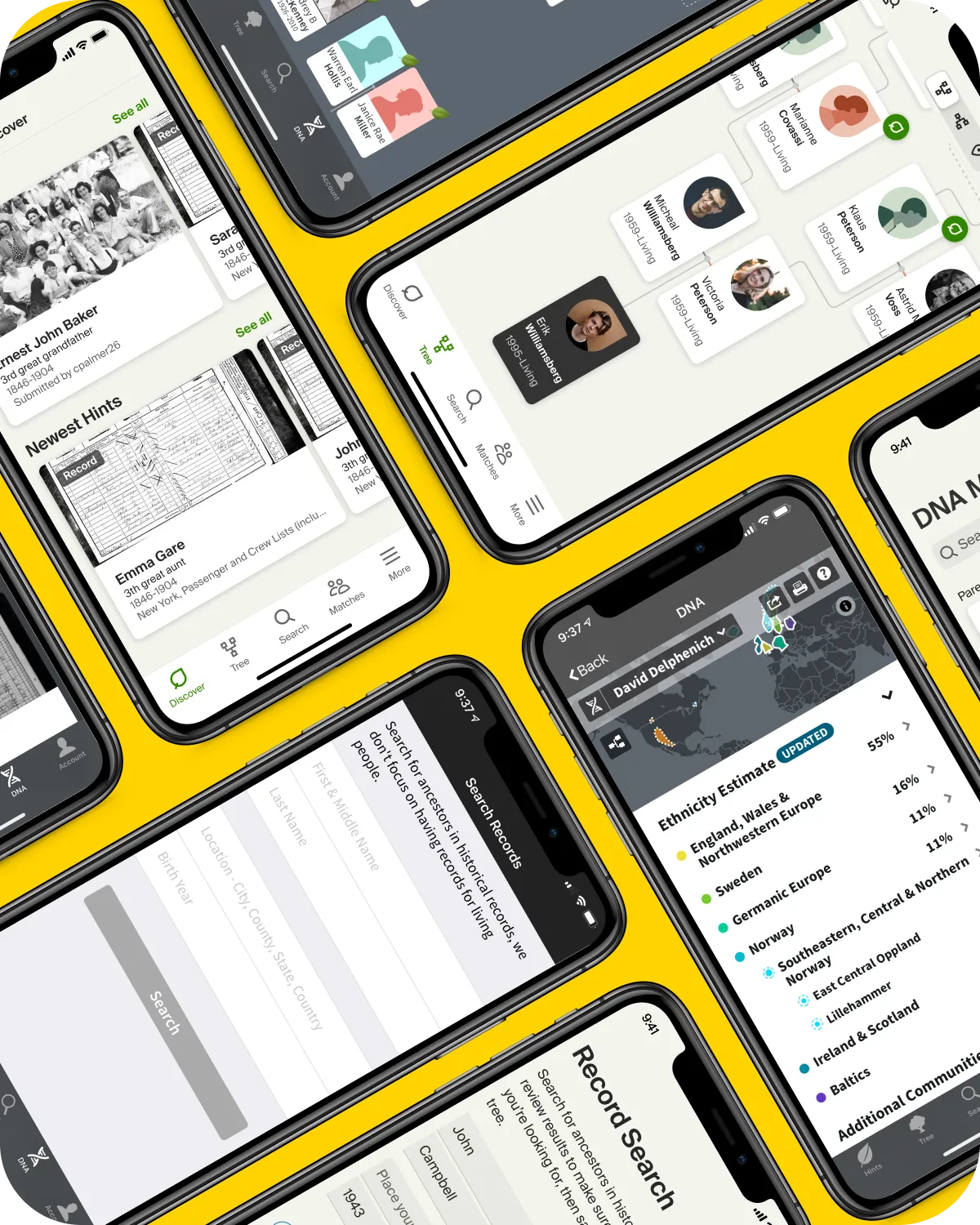
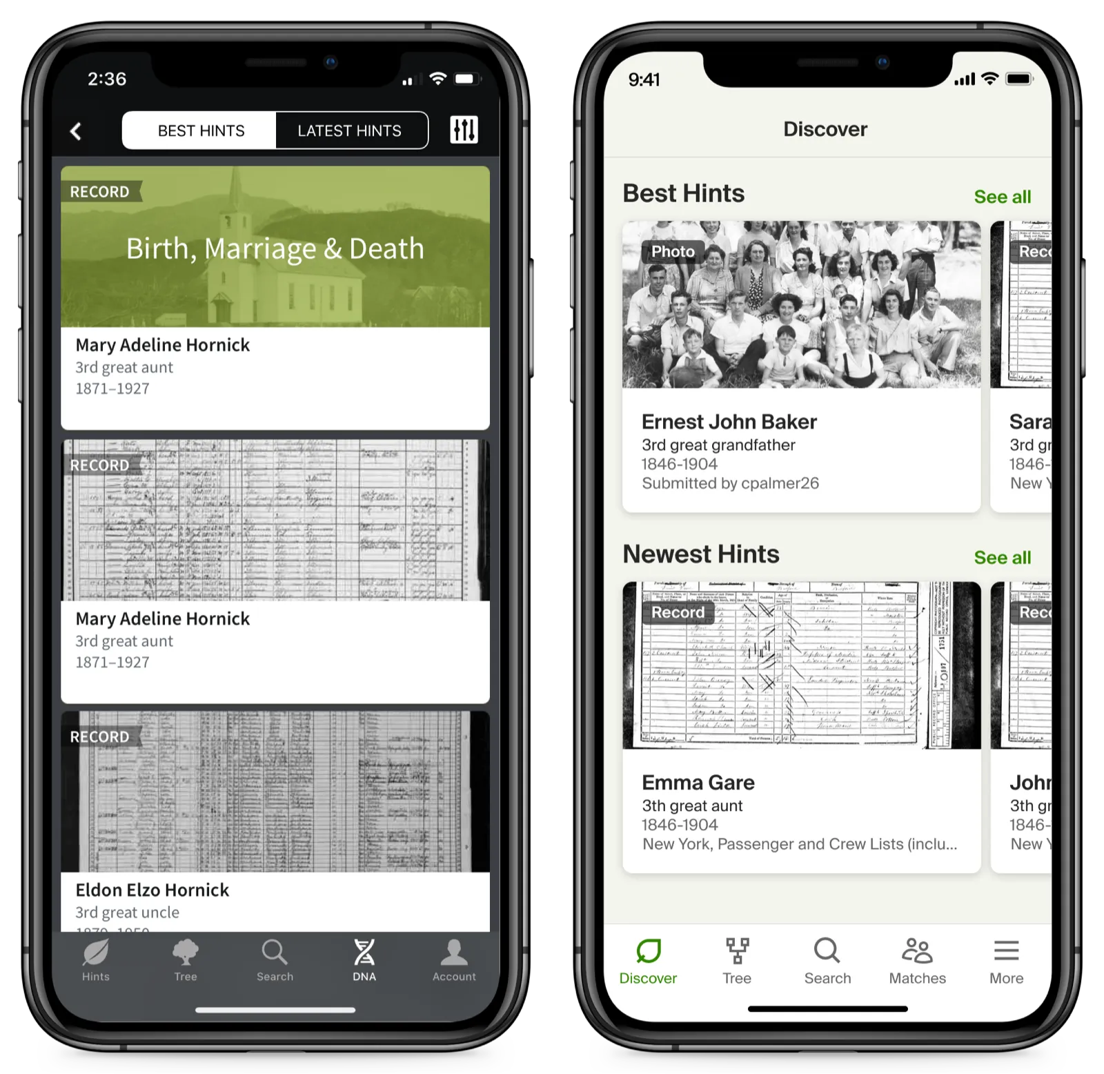
Map the overlap first. I compared the two apps function by function and theme by theme, looking for the shared spine — the places where one navigation could carry both. That became a unified structure with the same first and last tabs across apps, so moving between them stopped feeling like moving between products.
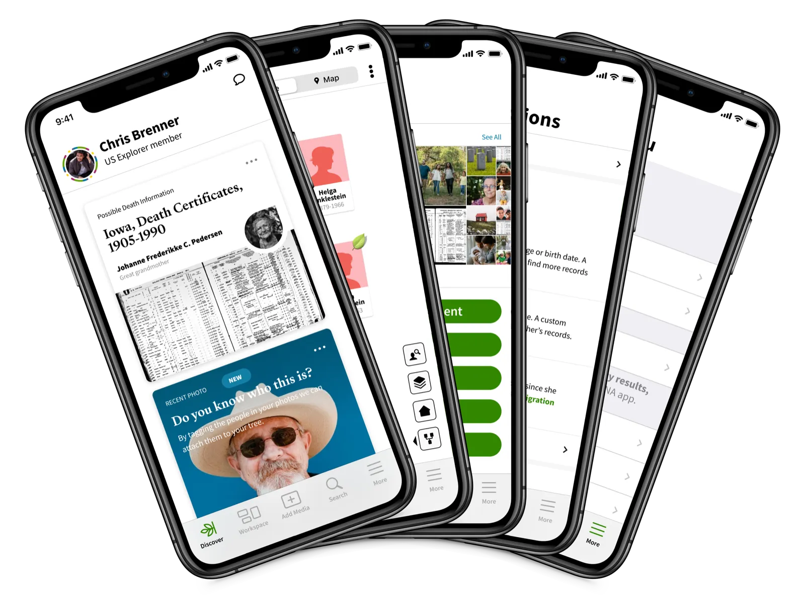
Then unify the surface. I brought both apps onto one visual language — shared color, card-based components — and folded in the new design system Ancestry had commissioned, so the modernization and the design-system migration pushed in the same direction instead of fighting.
Then make it real enough to believe. I built an interactive prototype so the vision could be felt, not just described.
A good way to get buy-in is to present something that looks achievable and has enough polish.
The hard part
A redesign this broad couldn’t land all at once — the apps were shipping features the whole time, and dropping a dramatically different experience on customers overnight invites backlash. So the strategy carried a phased roadmap: sequence the change into digestible steps, never a jarring overnight switch.
Outcome
The proposal landed well and became the blueprint the teams kept building from — it outlasted an org restructuring. The through-lines that stuck: the updated design system rolling across both apps, tighter feature integration between them, and a strategic reframing of DNA less as a standalone product and more as a way into family history.