Person Page Update
One person-page framework for every access level and both platforms — a Maps-style details drawer that keeps you in context.
- ROLE
- Designer
- TIMELINE
- 2021–2024
- PLATFORMS
- iOS · Android
- COMPANY
- Ancestry
At a glance
- Role: Designer
- Timeline: 2021–2024
- Platforms: iOS · Android
- Context: The most-used surface in the product
The problem
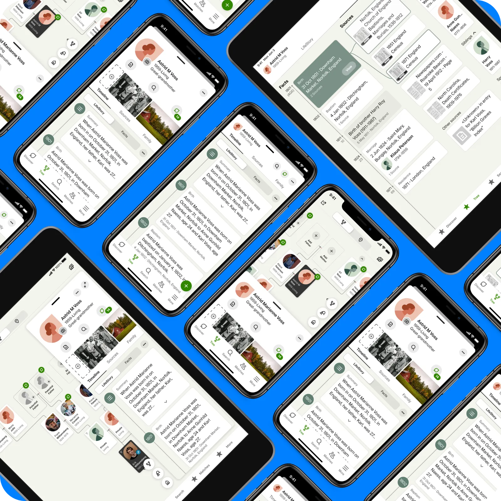
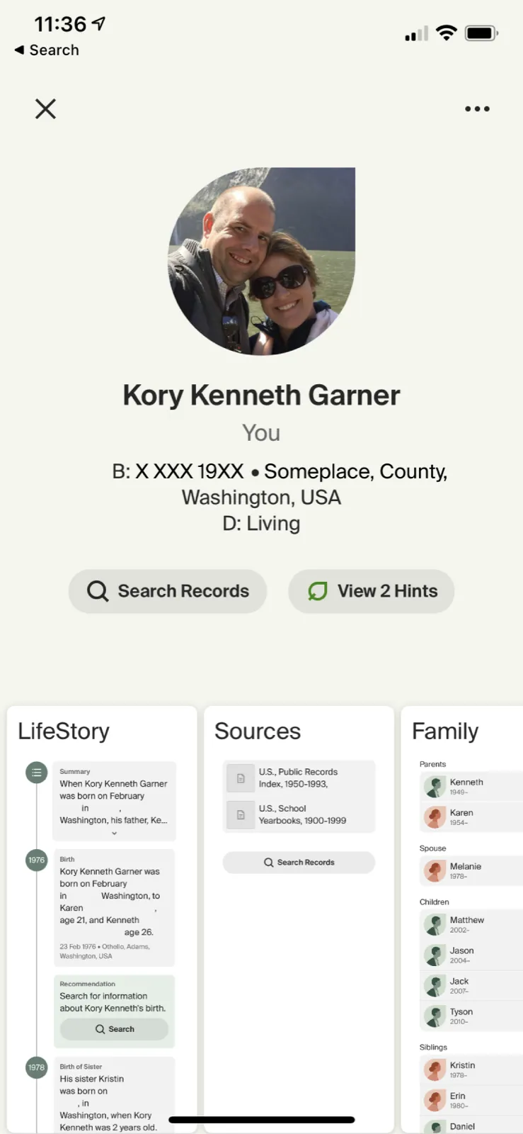
The Person Page is the most-used part of Ancestry — it’s where all of an ancestor’s details, sources, photos, and facts live. It had taken a design-system refresh, but it needed a real redesign. It also had to become several things at once: a lite view, a view-only view, and a fully editable view, depending on access. And iOS and Android had drifted into different mental models — those needed to become one.
The approach
I audited the surface across web, iOS, and Android and compared what each access level could actually do. That comparison is what the framework had to absorb.
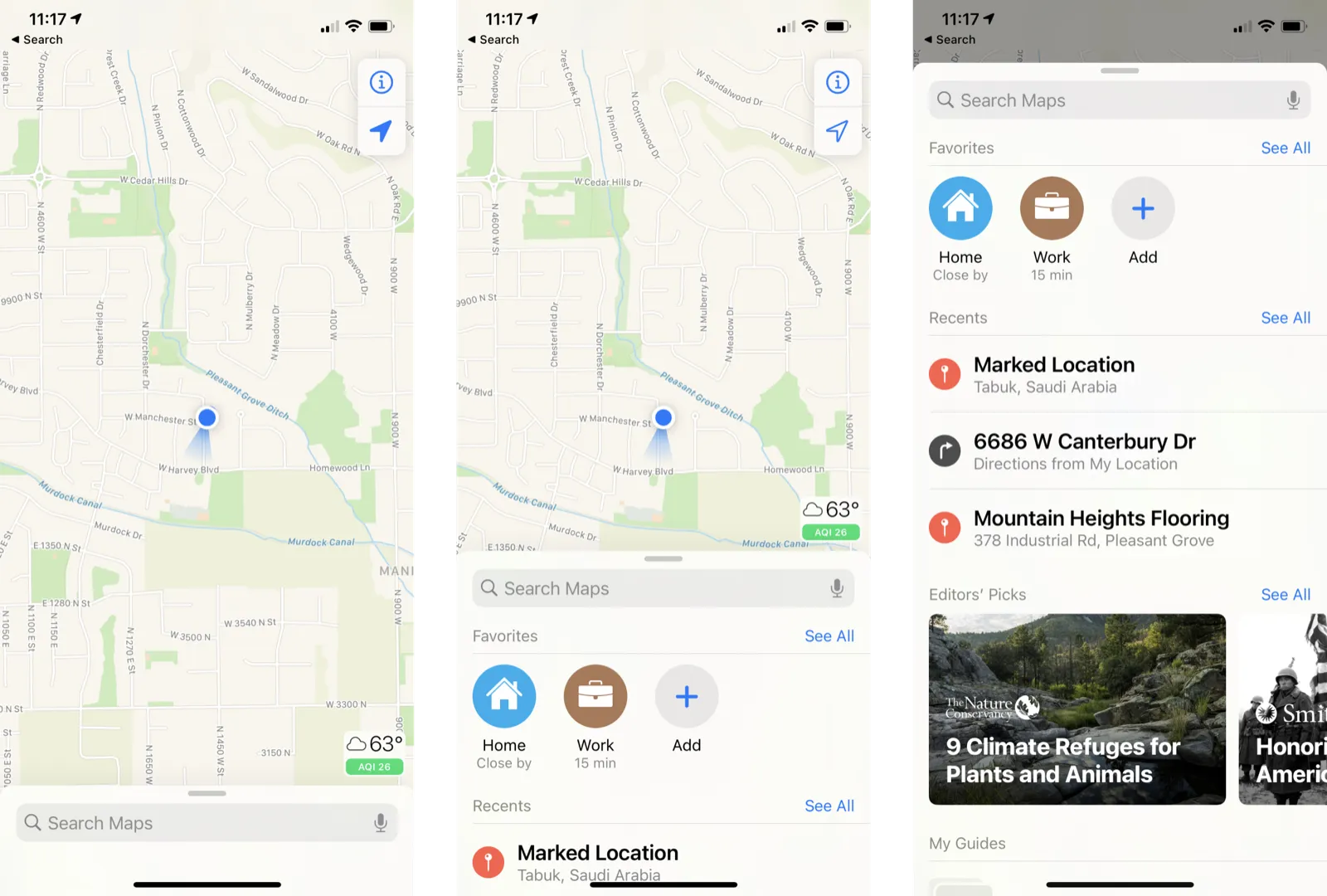
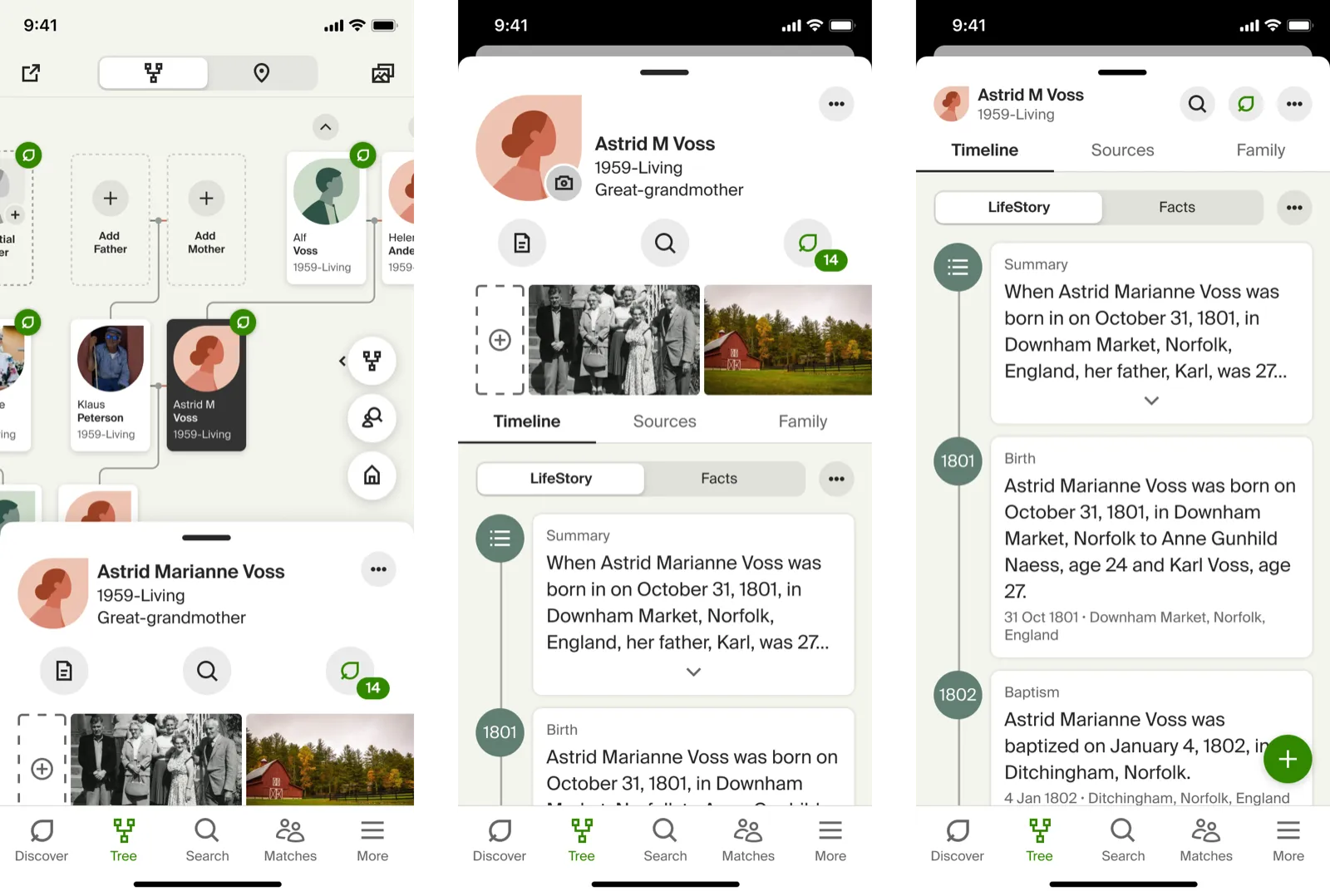
The move that unlocked it came from mapping apps. Apple Maps and Google Maps don’t yank you to a new screen when you tap a place — they raise a details drawer over the map and keep your context. I borrowed that: rather than forcing people to bounce between the tree and a person, the redesign brings the person up in a drawer, in context. The framework then layers information progressively by access level, so a restricted view keeps the same visual hierarchy as a full one — just with less inside it.
Tablets got the same idea. Instead of a phone layout stretched across a big screen, the person sits in a floating sidebar that can expand to fullscreen — the drawer pattern, scaled up.
Outcome
Testing came back positive — people liked the changes and the new capabilities, and the sections that rolled out performed well. More than any single screen, it left a framework the surface could keep growing into, including the DNA integration we’d started to explore.