Aspen Mobile Design System
A decade stewarding Ancestry's mobile design language across three systems — ending with a library where one component answers for both iOS and Android, and a switch flips between them.
- ROLE
- Designated owner — Aspen Mobile library
- TIMELINE
- 2015 – 2026 · Bonsai → Redwood → Aspen
- PLATFORMS
- iOS · Android
- COMPANY
- Ancestry
At a glance
- Role: Created Bonsai, a major contributor to Redwood, then designated owner of Aspen Mobile — always carried alongside full-time product work, never a full-time position
- Timeline: Roughly 2015 – 2026, across three systems: Bonsai, Redwood, Aspen
- Team: Two mobile designers on Aspen Mobile; separate designers owned Aspen Web
- The move: one component, both platforms — iOS and Android collapsed into a single toggleable component
Three systems, one product
Ancestry’s mobile apps ran on three design systems during my time there, and I had a hand in all three.
Bonsai (roughly 2015 – 2019) was mine. It didn’t start as a design system in the way we’d mean it today — it began as a set of styles and color swatches, the shared vocabulary a small team needs to stop guessing. It grew organically from there, accumulating real, defined components as more designers joined the team. That’s not a coincidence: every new designer is a new source of drift, and a system is the answer.
Redwood (roughly 2019 – 2025) arrived differently. Ancestry hired an outside firm to establish the foundation — palette, typography, the brand-level decisions — specifically so it wouldn’t have to pull its own designers off product work to do it. Turning that foundation into a working library fell to us. The web team handled their side; we handled mobile. I was a major contributor, not the only one.
Redwood is where the mobile library got serious. It carried native components for the things that should stay native — top navigation bars, tab bars, the furniture people expect their phone’s OS to own — plus a much larger set of cross-platform components for everything more central to Ancestry than to Apple or Google. A record card is an Ancestry idea, not an iOS one. I kept refining Redwood for years, folding in new Figma capabilities as they arrived: variables, modes, and the rest.
Aspen (2025 – 2026) was not a redesign of Ancestry. It was a rebranding of the design system itself, arriving with new direction about how the system would be maintained and expanded. Most of the hands-on work was modernization — rebuilding existing components on Figma capabilities that didn’t exist when they were first drawn.
One component, two platforms
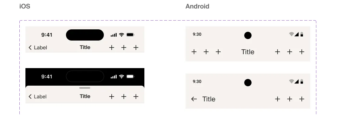
In Redwood, if you needed a tab bar you picked the iOS tab bar or the Android tab bar — two separate components sitting next to each other in the library. That works. It’s also a small tax you pay on every screen you design twice, and a standing invitation for the two platforms to drift apart every time someone grabs the wrong one.
What I wanted was to flip a screen between iOS and Android the way you flip it between light and dark: same design, one switch, both answers.
Aspen’s components got most of the way there. Everywhere the platforms genuinely diverge — top nav
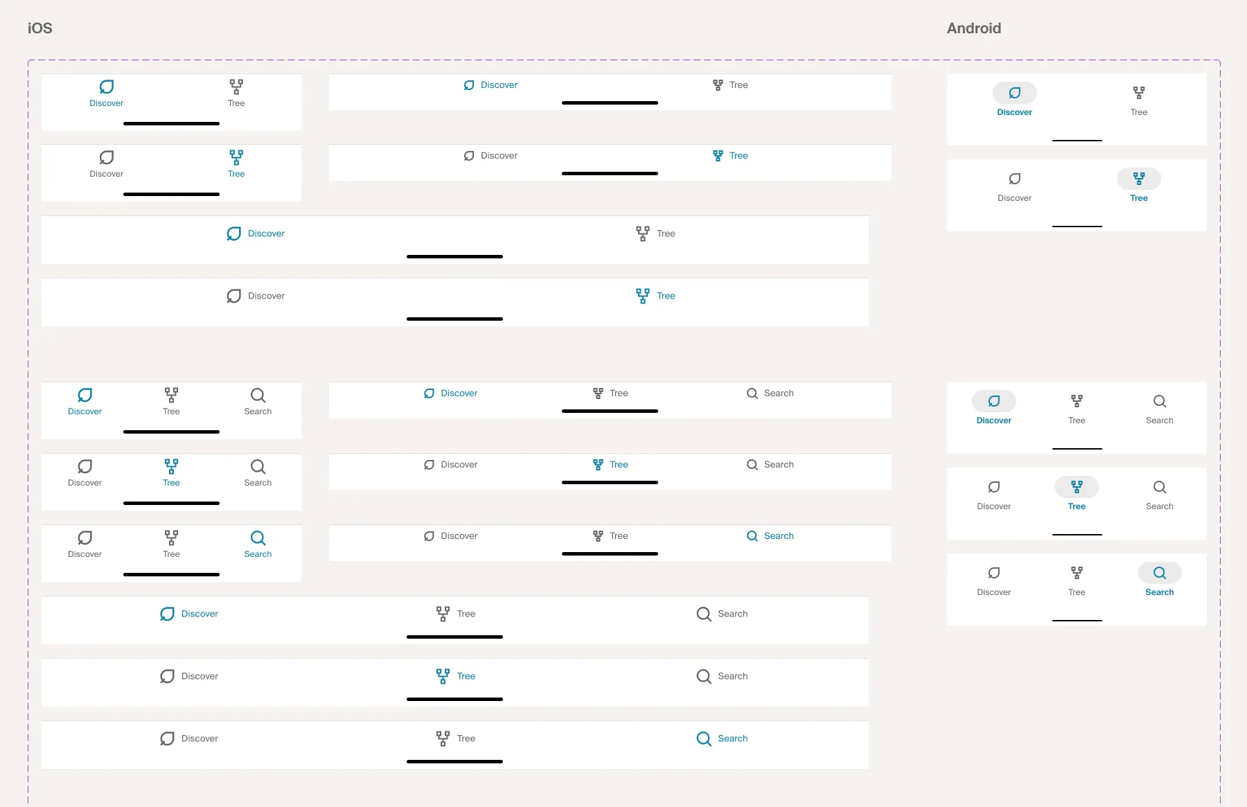
bars, tab bars, bottom sheets, menus, and the whole family of controls — the two versions collapsed
into a single component that toggles through its variant controls. The Ancestry-central
components never needed it; they were one thing to begin with. Mechanically it’s an iOS property —
boolean, defaulting to true. Boolean on purpose: a true/false property gives you a switch you can
flick, where an enumerated “Platform” property gives you a dropdown you have to open, read, and
choose from. Trivial difference once. Real difference on the hundredth use.
Building them was less glamorous than it sounds. For each piece of native furniture I’d start from Apple’s and Google’s own official component libraries — the real thing, not my impression of it — then re-skin it: Ancestry’s colors (bound to our variables, never pasted in), Ancestry’s typography, Ancestry’s icons. Then I’d combine both platforms’ versions into one component with the toggle across them.
The value isn’t the drawing. It’s that the platform difference becomes encoded. A designer no longer has to remember what Android does differently, because the component already knows.
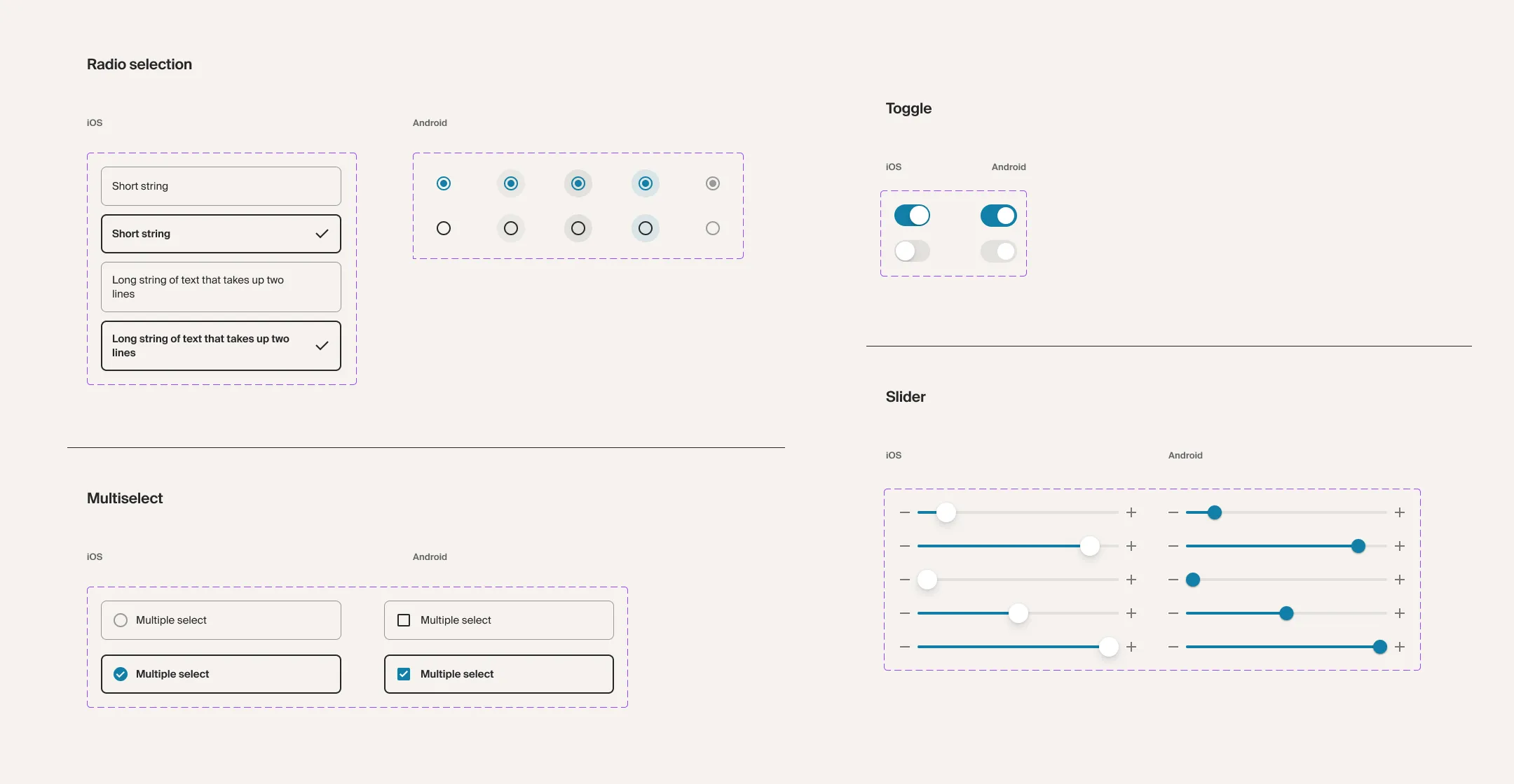
Light and dark worked the same way, through variable modes. So any given screen carried its full matrix — two platforms, two appearances — out of one component set.
The flip I didn’t land
I never got the whole-artboard flip working, and I know exactly where it broke: I couldn’t find a way to tie a variable mode change to a component variant setting. Light and dark switch by mode, which cascades across an entire frame at once. Platform switches by variant, which you set per instance. With no bridge between the two, “flip this screen to Android” stayed “flip these forty components to Android.”
Right at the end of my time at Ancestry I spotted something in Apple’s component library that looked like it might be that bridge — a hint the capability had arrived, or could at least be faked convincingly. I didn’t get to dig into it. It’s the first thing I’d pick back up.
What it takes to be Core
Owning a library mostly means being the person who says what Core means. Anyone could bring me a component. Getting it into Core meant working through everything a core component has to carry:
- Both platforms, on the toggle
- Light and dark, through variable modes
- Every interactive state
- Color, type, and spacing bound to variables — never hardcoded
- Naming consistent with the rest of the library
- Documentation
- Accessibility
And then the requirement that’s harder than all of those combined: it has to be flexible enough to work anywhere in the app.
That’s where design-system work turns into diplomacy. The pattern repeats endlessly. A designer on DNA invents something good for a DNA problem. Someone on Record Search sees it and thinks: if I add one piece, that solves mine too. Now there are two of them, nearly identical. Next quarter there are five. A Core component can’t be the DNA version with a bolt-on — it has to be the version that serves DNA, Record Search, and the team that hasn’t asked yet.
Getting there took one of two routes. Sometimes I’d build every option into the component, so each team could take what it needed from one source. Other times the honest answer was negotiation — going to teams and saying: make yours more like this one, so we’re all doing the same thing. The component was rarely the hard part. Agreement was.
Extensions: the pressure valve
A high bar for Core creates its own problem. A feature team with a ship date can’t wait on a library process, and if the only options are “wait” or “go around,” everyone goes around.
The answer was an Extension library — our head of design’s idea; the other mobile designer and I built the file and ran it. Extensions is where a team publishes a component it made for its own work: a better way of presenting instructions to someone, a different style of card, anything not already in Core that we might eventually want more broadly. Other teams find it three ways — seeing it live in the app, catching it in a demo, or browsing the Extension library directly — and they’re free to use it in their own space. No checklist, no approval, no queue.
What keeps it from being a junk drawer is that it doubles as an instrument. Two readings tell you something has outgrown it: adoption climbing, or near-duplicates proliferating — the same idea showing up four times in four slightly different treatments. Either signal means it’s time to do the expensive work and make it Core. The system watches for convergence instead of trying to mandate it up front.
Worth being straight about: during my time on Aspen, nothing actually made that trip. The era’s work was modernization — rebuilding Redwood’s library on current Figma capabilities — and the promotion path was a road we’d paved and hadn’t yet driven.
Where a library earns its keep
Three payoffs, in order of how much they mattered.
Speed across platforms. The big one. Designing something on one platform and then adapting it for the other becomes close to free, because the components already know what changes. That’s what made AncestryPreserve possible: iOS, Android, and web at once, in three months. Preserve inherited parity instead of renegotiating it screen by screen.
Consistency — the boring superpower. The generic benefit of any design library, and the reason they exist at all: a product line that looks like one product.
Absorbing the platforms as they change. This one is specific to mobile and I think it’s underrated. Every year Apple and Google ship new paradigms, and somebody has to decide what Ancestry’s version of a new pattern is. Deciding it inside the library means it’s decided once, by the people whose job that is — and then every designer can start building with it immediately, instead of the team generating forty screens’ worth of independent interpretations.
The parts that stayed informal
Two gaps, and they’re the honest ones.
Web-to-mobile equivalency. Inside the library, cross-platform answers were solid — the iOS/Android difference lived in the component itself. What never got written down was the layer above it: a formal mapping of this pattern on web equals this on iOS equals this on Android. I wanted that document for years and never had the time to make it. Those of us on mobile had simply learned by practice to map one UI to its counterparts, and practiced knowledge is exactly the kind that doesn’t survive a team change.
Design-to-code. There were mappings from library components to native code, but they were looser than they should have been. Engineers sometimes built their own version of a component instead. Sometimes iOS mapped one way and Android mapped another — which quietly reintroduces the drift a library exists to prevent. What we were pointed at, and hadn’t reached, was a true mapping between code components and Figma components.
Reflection
What I’m proudest of is the unification — taking a library where iOS and Android ran in parallel and making them one thing with a switch. With more time I believe we’d have gotten the theme switching working too. I could see the shape of it.
What I’d do differently is go a level deeper on code. Everything I’d want next sits on that axis: a real, maintained mapping between design components and dev components, so the library isn’t a description of the app but the same object as the app.
That’s also where I have to be honest about capacity. Owning the design system was never my job title — it was a responsibility I carried on top of product work. A part-time system needs leverage, and leverage is exactly what the current generation of AI tooling offers. Those tools are the difference between “we’d get to that with more headcount” and “we can get to that now.”
Three systems, a decade, and the through-line never changed: somebody has to hold the whole thing coherent while everyone else ships. For most of ten years, that was me.