Ancestry App Update
Company: Ancestry
Project Type: Mobile App Strategy & Design
Role: Lead
The story so far…
Near the end of 2019 I was asked to go back and lead the Family History app team. Over the last couple of years, the DNA app had gotten most of the attention internally. The Family History had continued to churn out new features and do great things, but the two apps were drifting further and further apart.
I was asked to help bring the Family History app up to date and get it better aligned with the DNA app. In addition, I wanted to explore an idea that we could improve the family history experience by integrating the DNA features that help with family history work rather than treating family history and DNA as two separate experiences. This was what we had done for the last several years, but with the lack of coordination between the teams, it just wasn't delivering on the potential.
The goals…
- Unify the app navigational structures so users have a sense of familiarity
- Integrate DNA functions that are related to family history in better way than had been attempted in the past
- Establish logical points where we would have users move between apps
- Update the visual design of the app to be more inline with the DNA app
- Use the mobile device capabillities to enable new ways of doing family history work

The process…

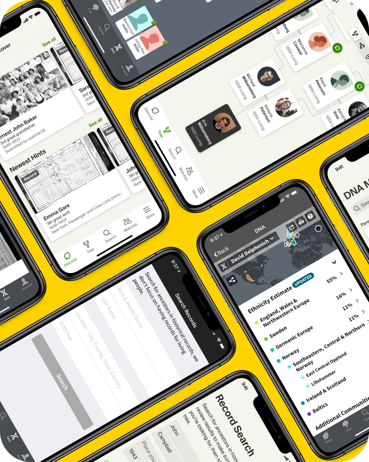
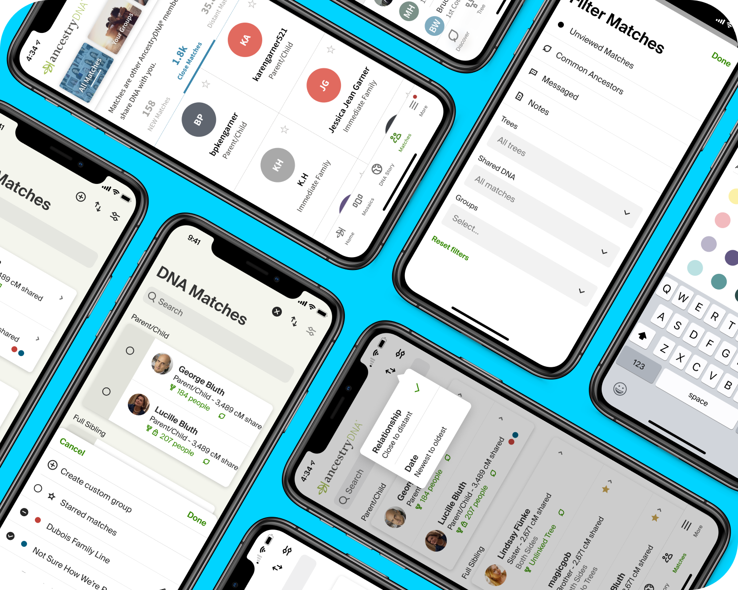
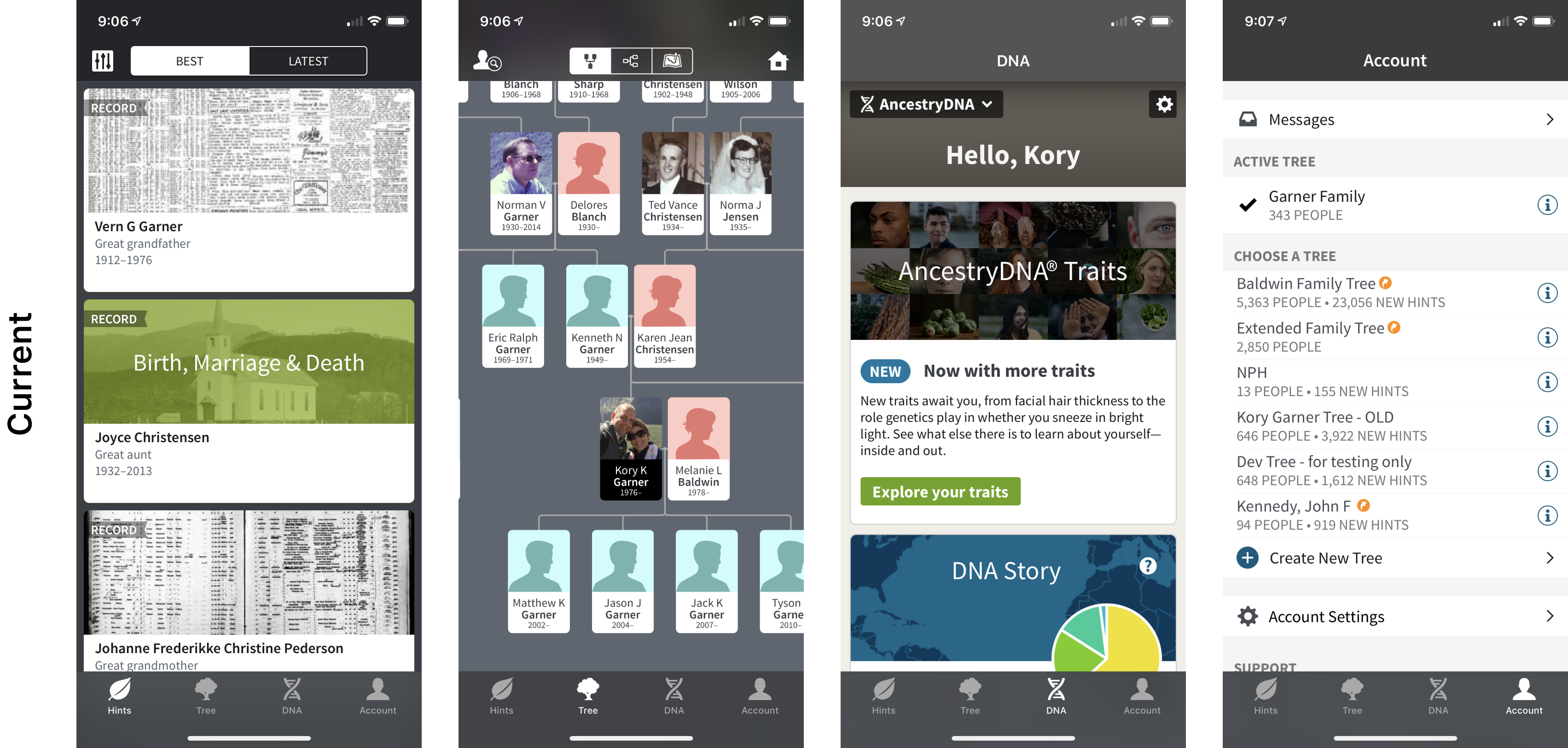
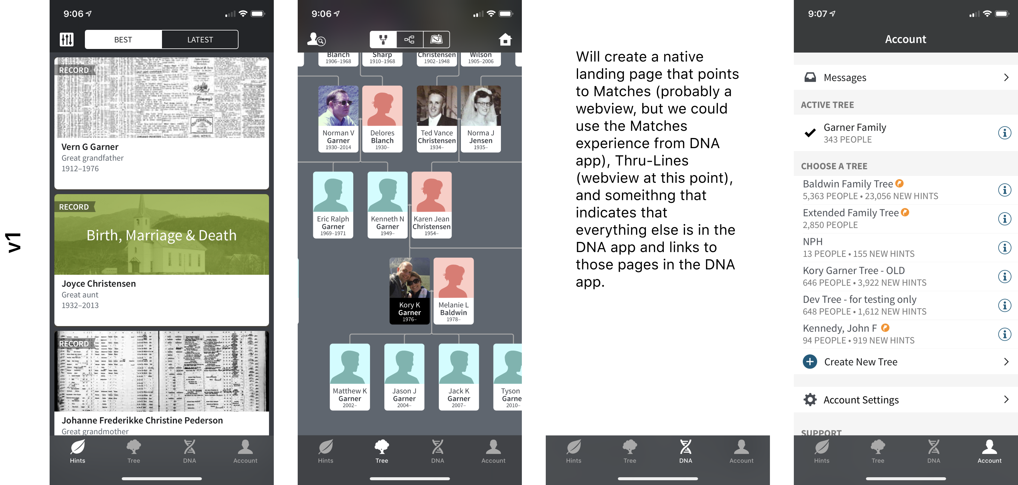
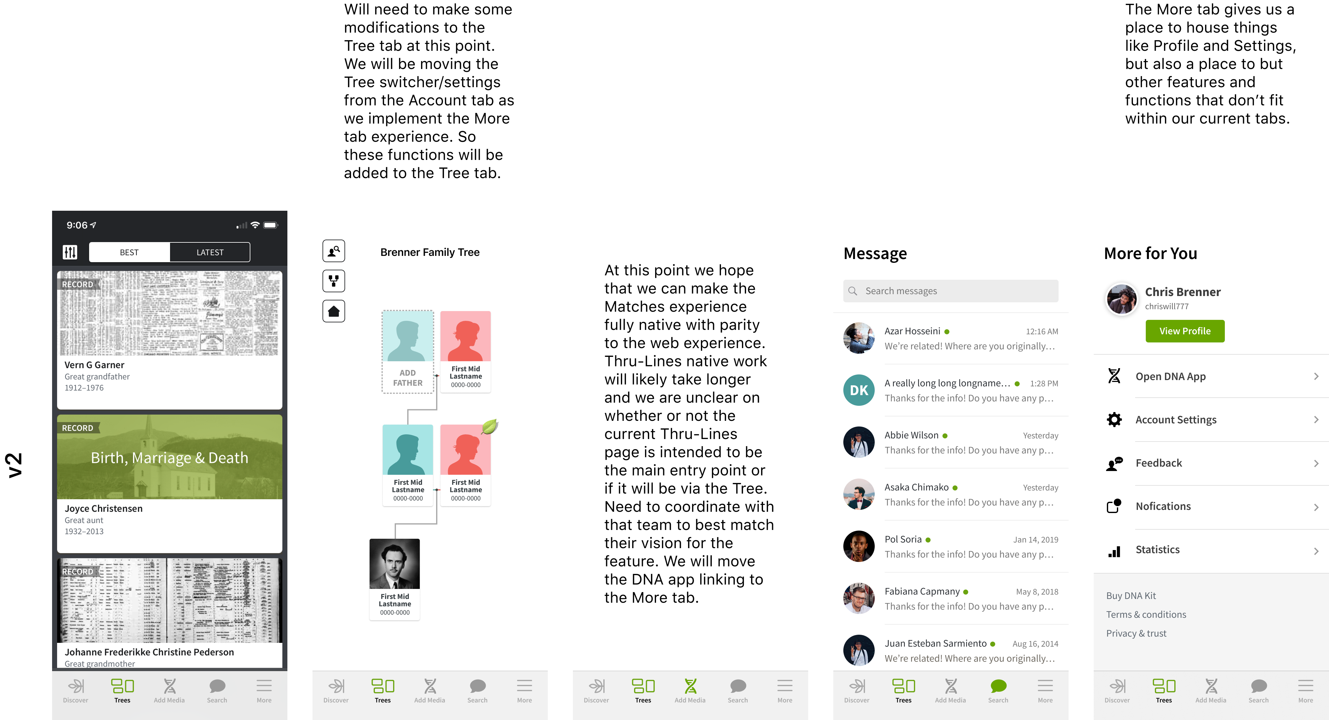
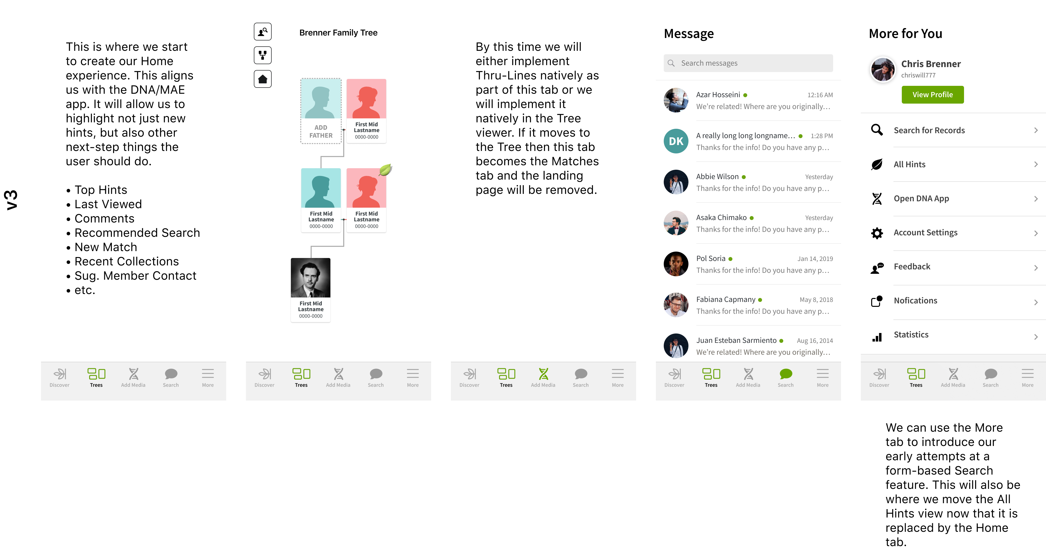
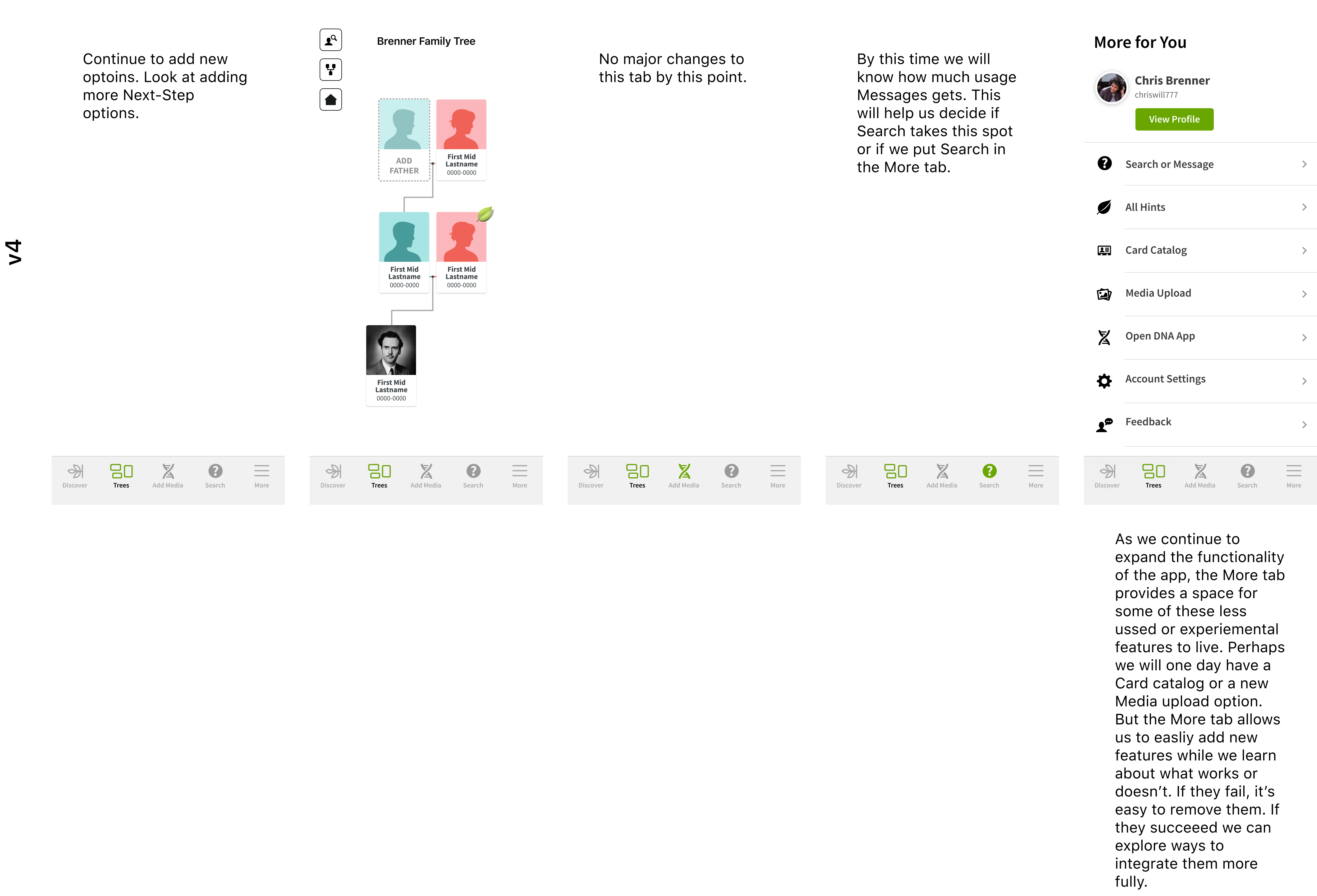
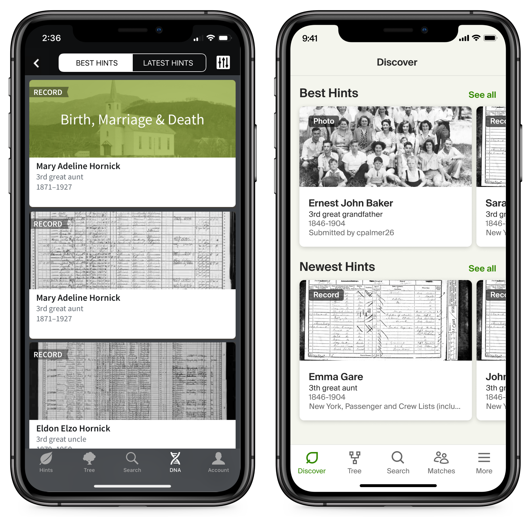
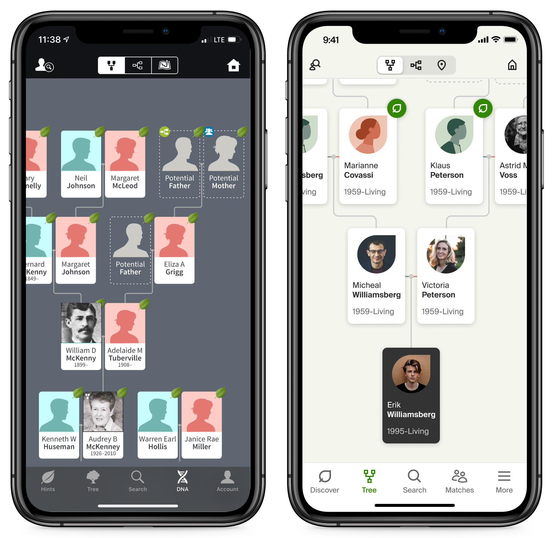
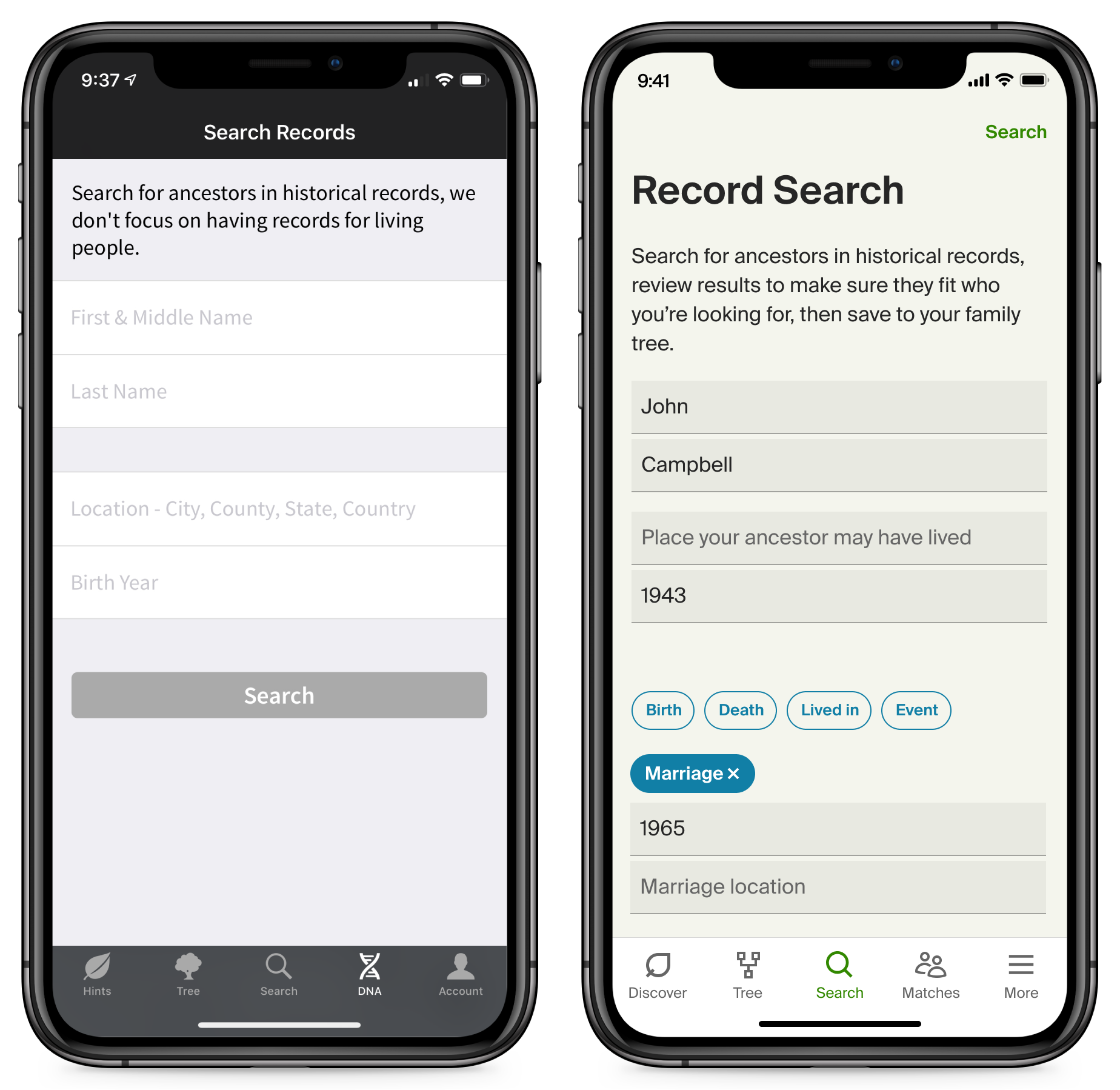
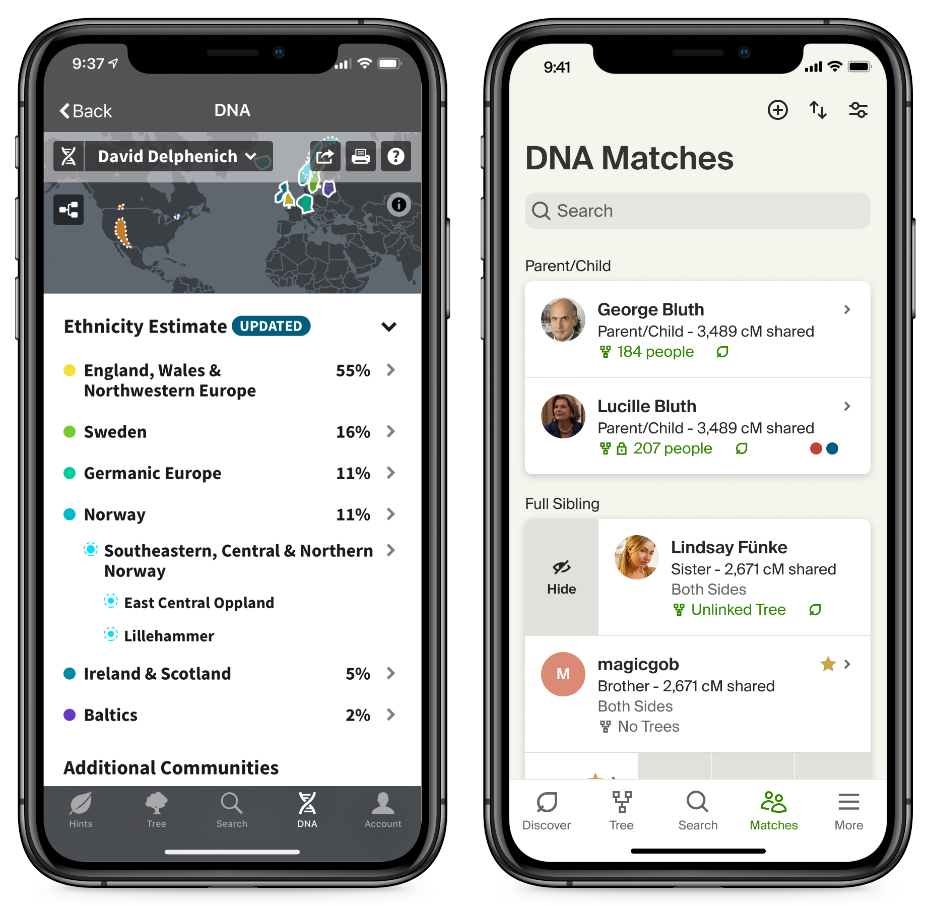
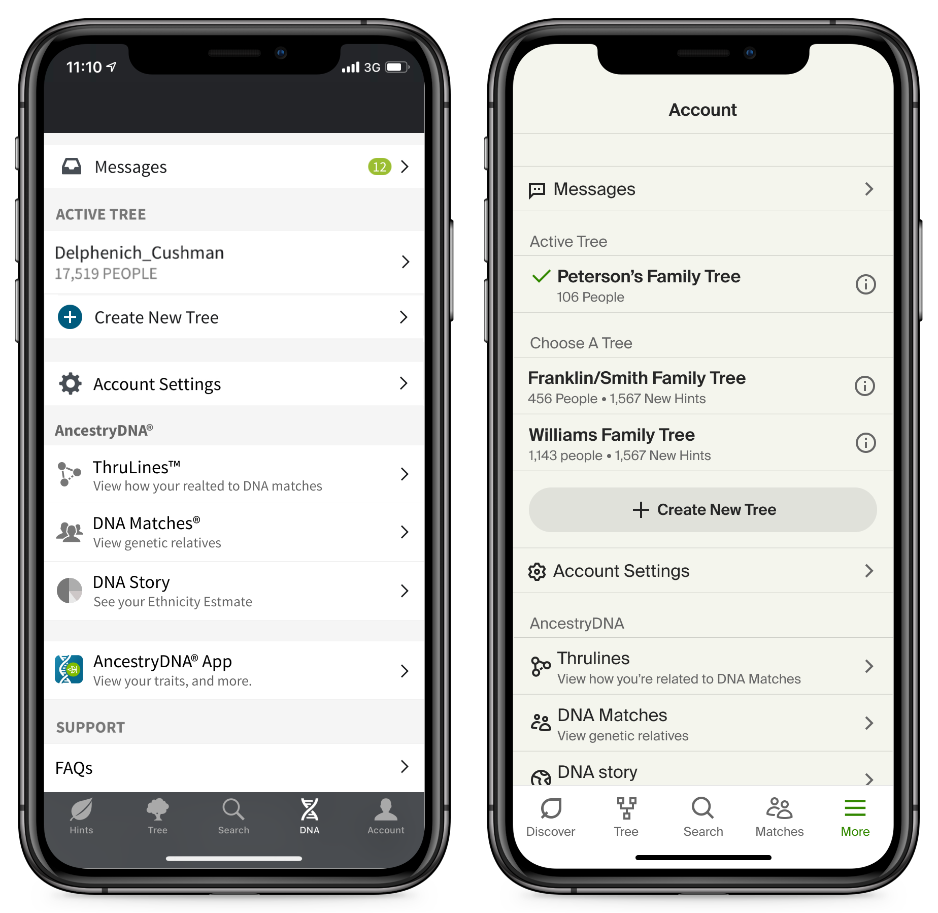
I started by doing a comparison of the apps, what parts overlapped functionally, which overlapped thematically, and tried to determine if there was a series of tabs that would help them feel united. I felt that making the first and last tabs be the same would be a good fit and the middle tabs could be specific to each apps particular tasks. The first tab in each app would be a feed of important updates and recommended tasks and actions. The last tab would be a 'More' tab where we would put things like Profile, Account, as well as providing a home for features that couldn't be directly integrated into the existing tabs.
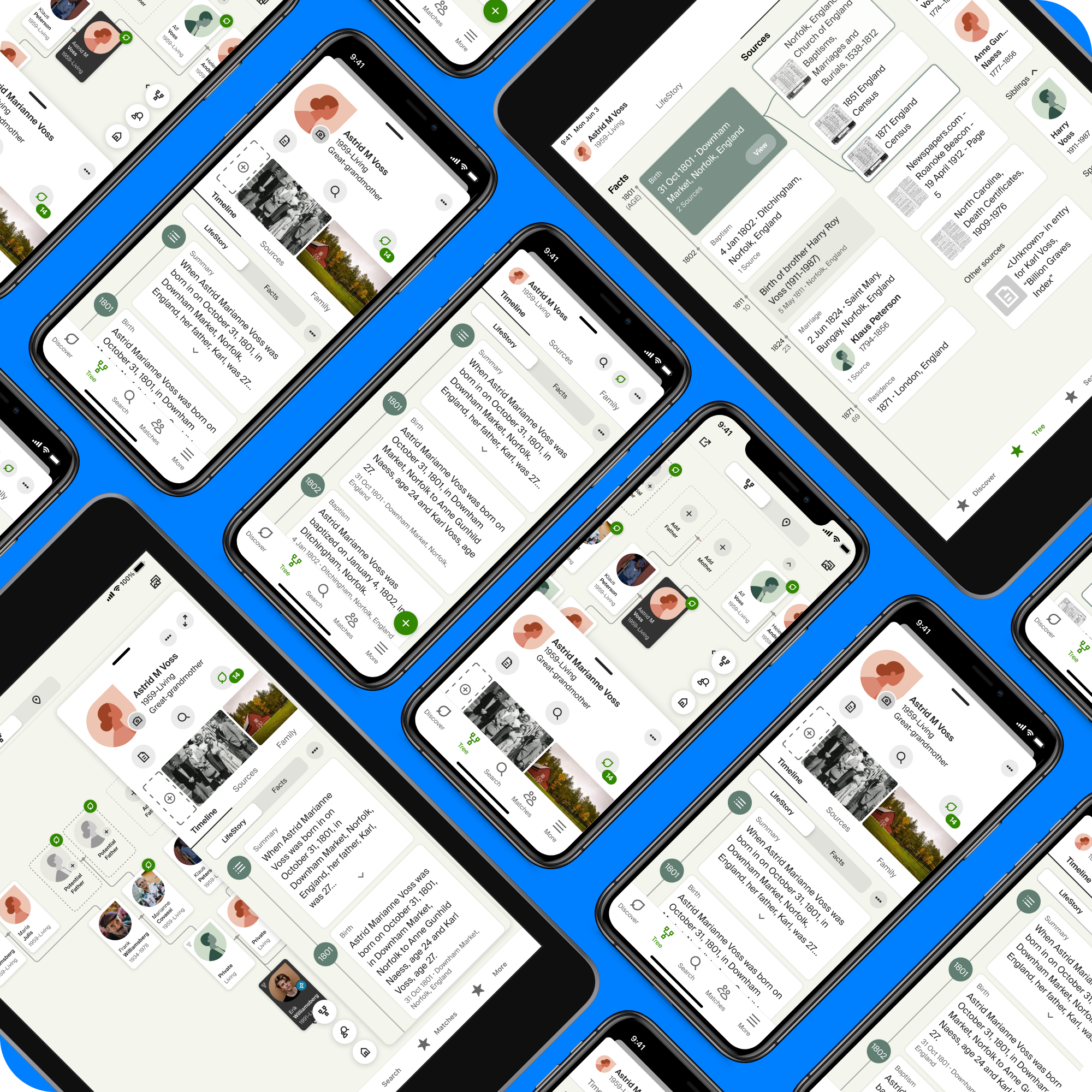
At the same time I started playing with ideas on how to unify the apps visually. I started by playing with copying the color scheme and determining if there were particular components I could use in both apps. The DNA app was big on cards so I tried to bring those over where it made sense. Midway through this effort, Ancestry brought in an outside firm to help us develop a new design system that would be used across the web and the apps. The final mocks will show this new design.
The sales pitch…

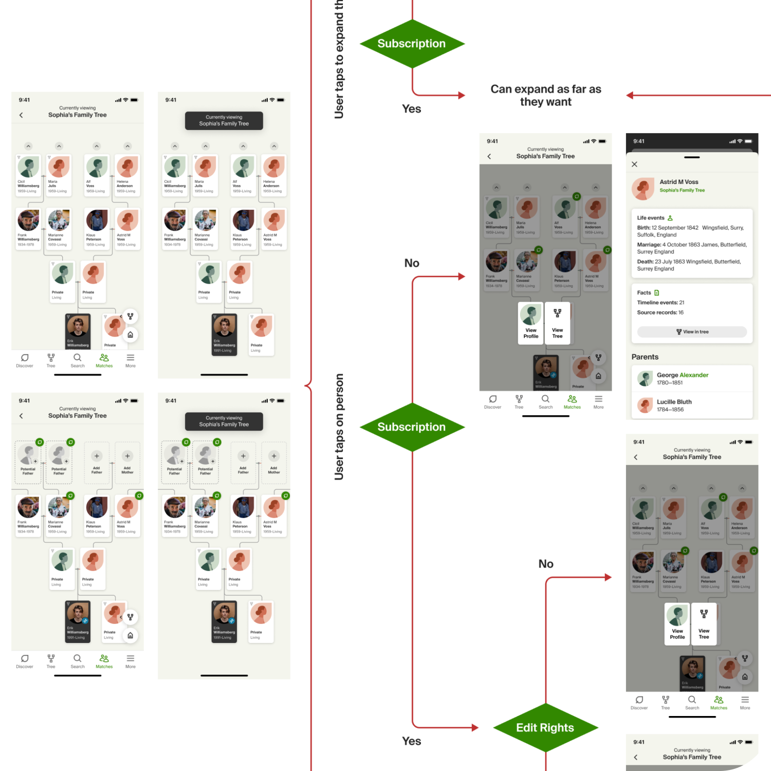
Try out the prototype.
I learned a long time ago that a good way to get buy in is to present something that looks acheivable and has enough polish to make you want to see that on your phone. A prototype works amazingly well to help everyone grasp the vision better than static mocks and slide decks.
A lot of deisgners don't want to spend time making something that has a lot of polish at this stage because they are (rightly) concerned that they will end up making something that ultimately will not be used and, very likely, thrown away. The key is to try and leverage your design system or other references. Remember that you aren't designing the final mocks to devs. Don't be afraid to do some hand-waving on the details of how something actually behaves. Those details will get sorted out before you actually build it.
The best laid plans…
One challenge you always encounter in a massive overhaul and redesign is that you can't usually afford to stop all releases and just work on the new update for six months or a year and then release the magical new update. That guarantees a massive backlash from your customers. They get no new features or improvements for a long time and then all of a sudden, everything is different. Ancestry's customers are particularly sensitive to these types of dramatic shifts.
The best way to deal with this is to create a roadmap that makes the changes in smaller batches. Allowing more time for the customer to adjust as the app is changing around them. I worked with the team to determine a series of steps that take us from our current state to our final destination. We then worked together to prioritize the new features along with the updates and changes. I also tried to prep the team that we would learn things along the way that might make us change some of these plans. We might end up with a slightly different version than we planned, but that it would actually be better because we were listening and learning as we moved along.
The outcomes…
Everyone loved it! This isn't typically the way these stories go ,but in this case it's true. Even after a re-org of the mobile group, the new leadership used my plan as their starting point. You can see in the app today that many of the things I proposed have been added and the mobile teams are still working to add more.
There have definitely been some changes along the way. The obvious one is that Ancestry decided to update their design system and we have updated both apps to use this new system. Also, there has been a strategic shift in the company to make DNA focus more on how it helps people do their family history rather than a stand alone product. This has dramatically changed the discussion about when we hand off to the DNA app and greatly increased the level of integration we are pursuing in adding DNA features to the Family History app.
In future case studies, I will walk through the particulars of how we are implementing some of these new features and integrations. This is just the starting point for everything the team has accomplished over the last several years.
Selected Works