Person Page Update
Company: Ancestry
Project Type: Mobile App Design
Role: Designer
The story so far…
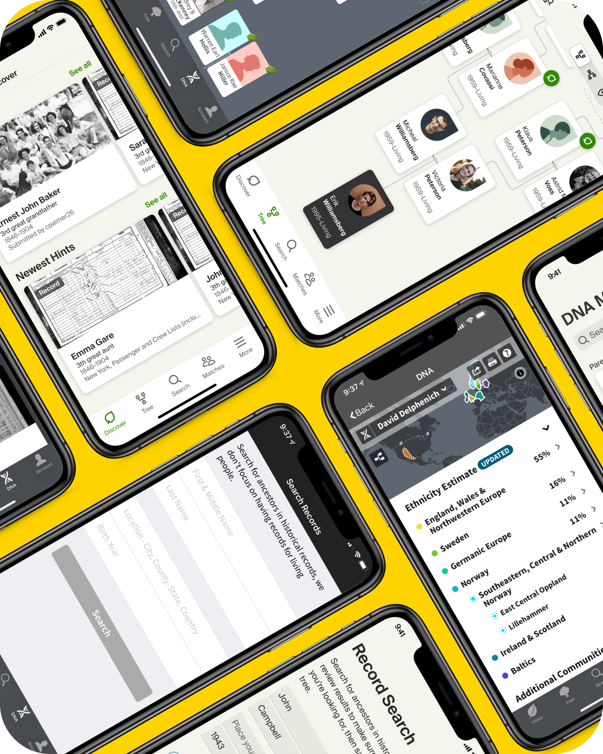
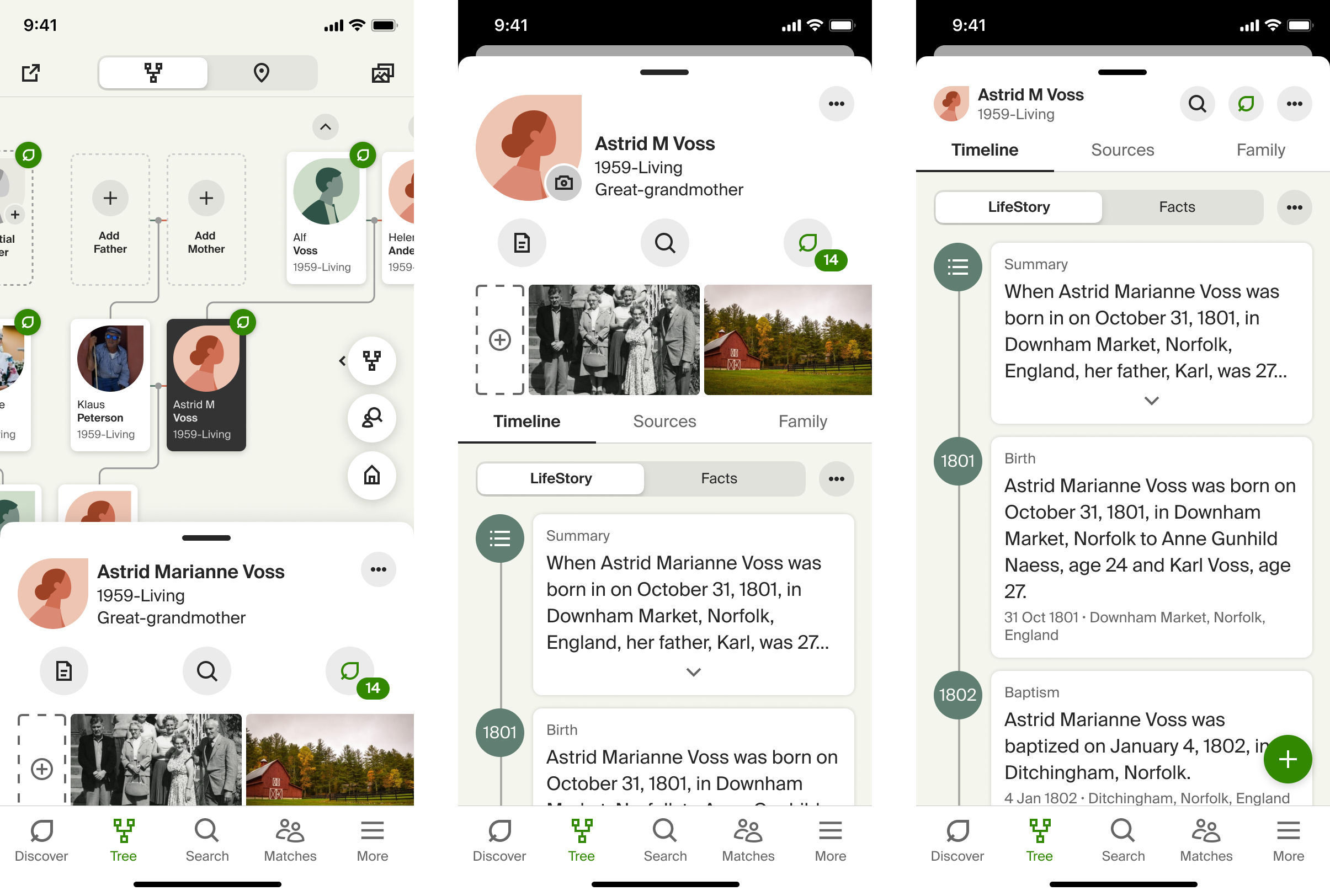
The Person Page is the most heavily used part of the site and the app. It's the page that gets opened up every time you select someone from your tree. It holds all of the details, sources, photos, and other information about your ancestor's life. Users spend most of there time interacting with this screen.
The current page had been reskinned as part of the update to our new design system, but what it needed was a full redesign. With the ability to view public trees of other Ancestry members we needed to add a couple of different versions of this screen. We needed a bare bones 'lite' version, along with a view-only version, in addition to our current fully-editable version. Additionally, the Android and iOS versions of this page were sporting two, conceptually similar, but visually different, desgins. They also had some differing capabilities that needed to unified.
The goals…
- Create a new person page framework that can be used across the various access levels
- Unify the functionality across both iOS and Android
- Create something more engaging and glanceable to help users find what they're looking for more quickly
- Better utilize the screen real estate, especially on tablets

The process…
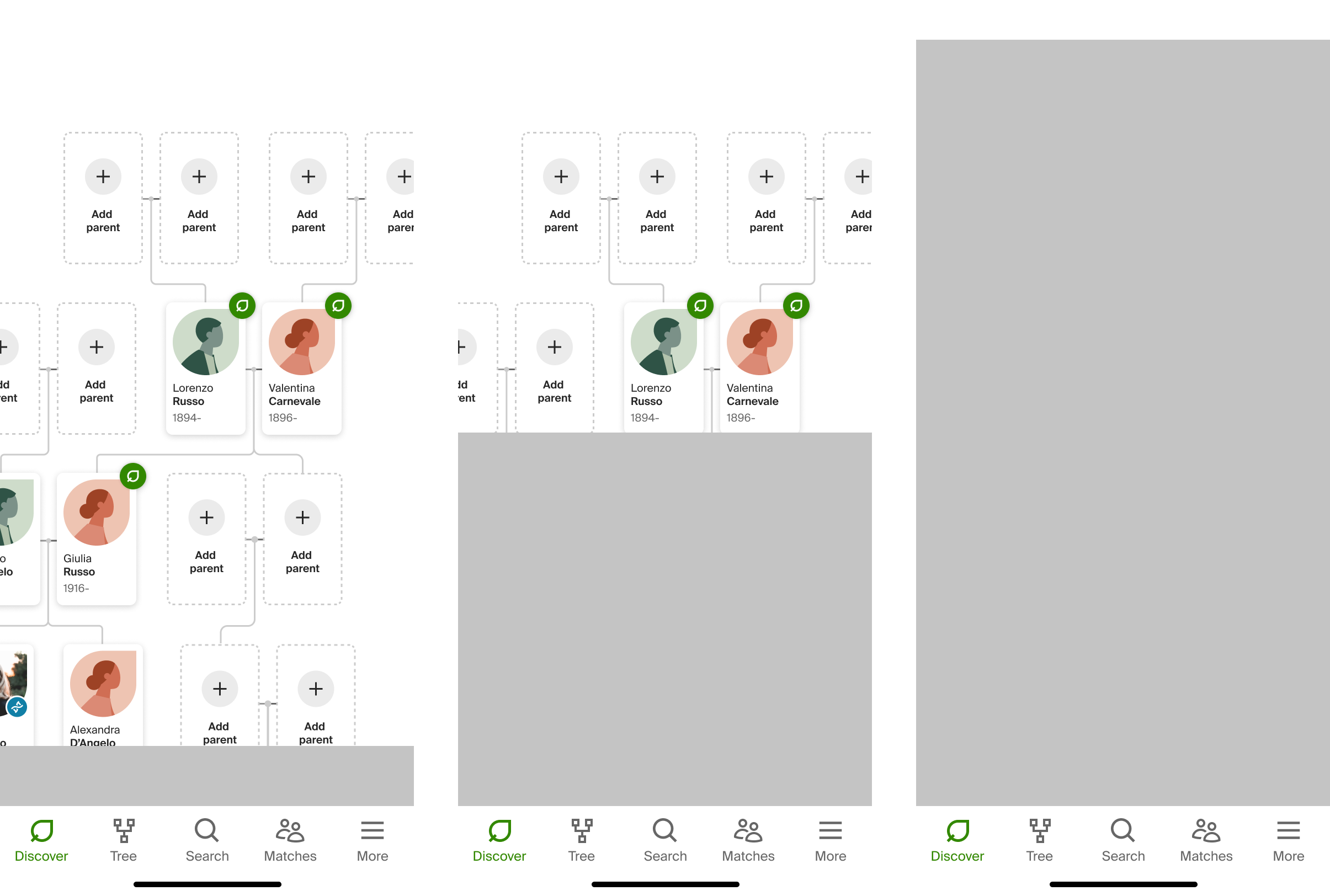
I started with an audit comparing the features and functionality acrosss web, iOS, and Android. Then I compared the features available at each access level. From there I was ready to start exploring ways to incorporate all of this into a cohesive framework.

Some Inspiration
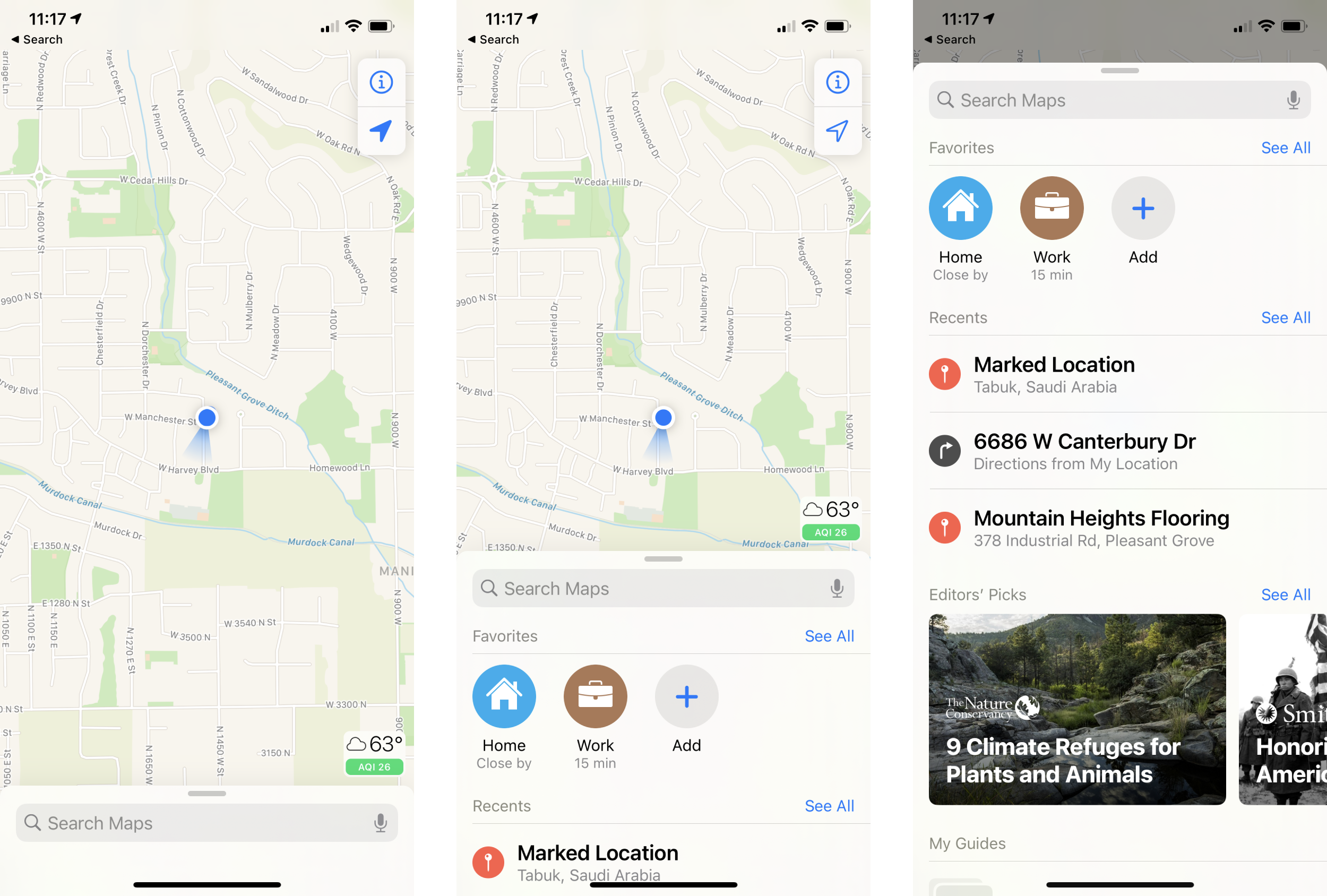
Rather than forcing the user to pogo back and forth between the tree and the person page, I wanted to see if we could build something like Apple or Google Maps. The tree is definitely akin to a map and the person page is like the details drawer, showing the specifics of whatever was tapped on the map.
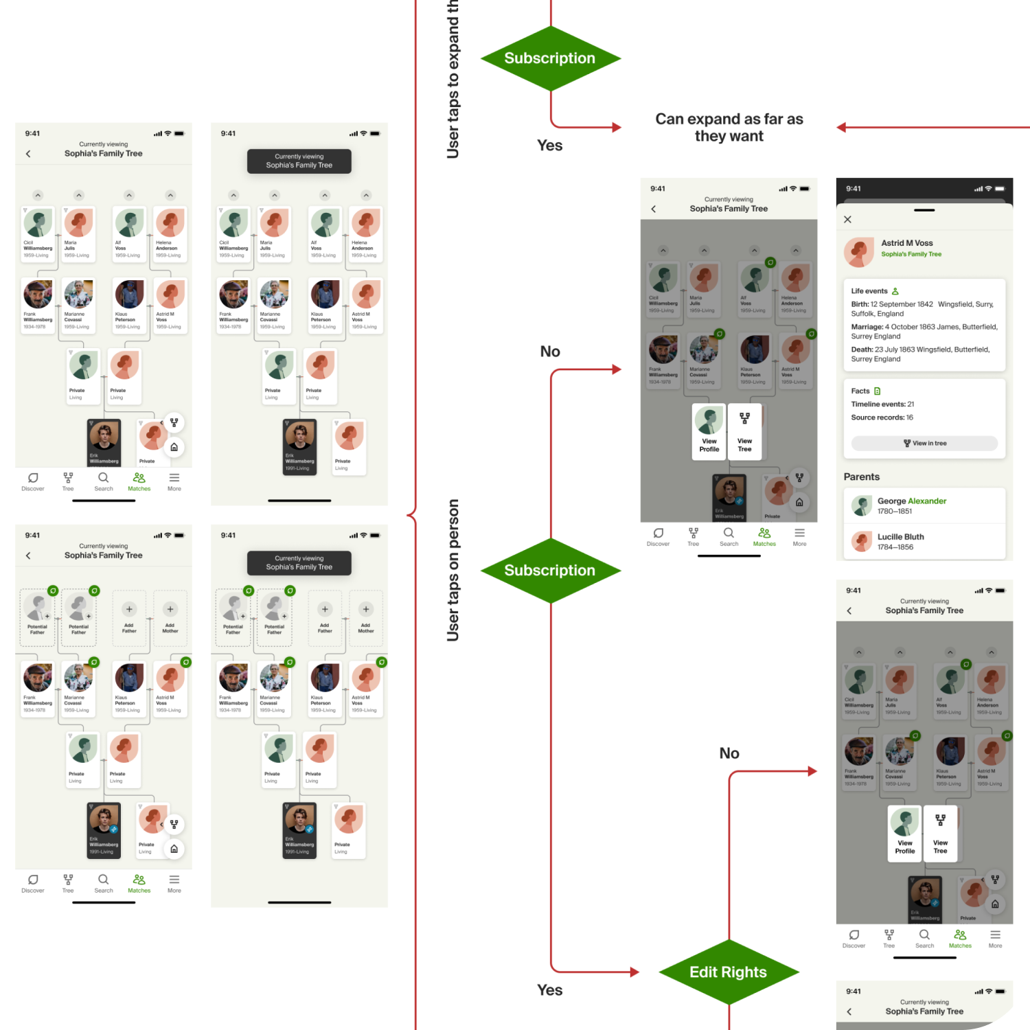
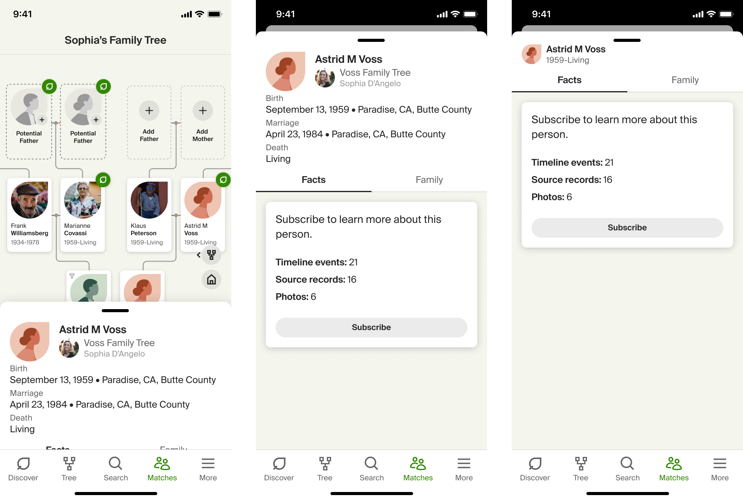
I wanted the different access levels to feel as similar as possible, a challenge when the level of content can be drastically restricted. The goal was to make it feel like we are progressively layerin in more and richer details as your access level increases.
Another thing I had to figure out with the drawer was what information did users need to see in the half-open state. I consulted a lot with our web team and did some user research to ensure that the most critical data was display front and center.
Once I understood all of that I was able to create a framework that allowed me to layer in the pertinent data, allow access to furhter details, and show the most crucial information for each access level. All in a way that felt cohesive.
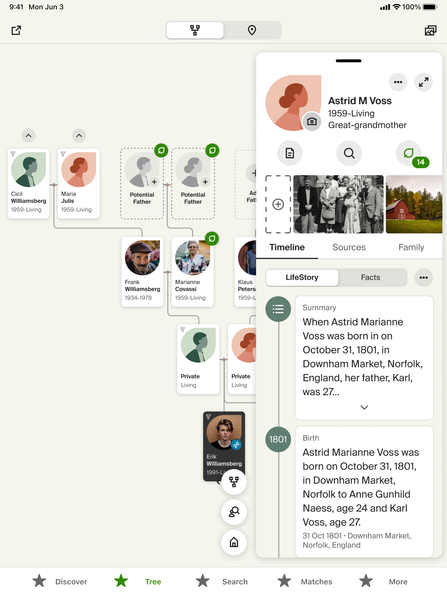
Another thing I wanted to correct in this redesign was the poor use of space we had on tablets. Our current UI was baisically just scaled up and didn't do a great job of using the available space.
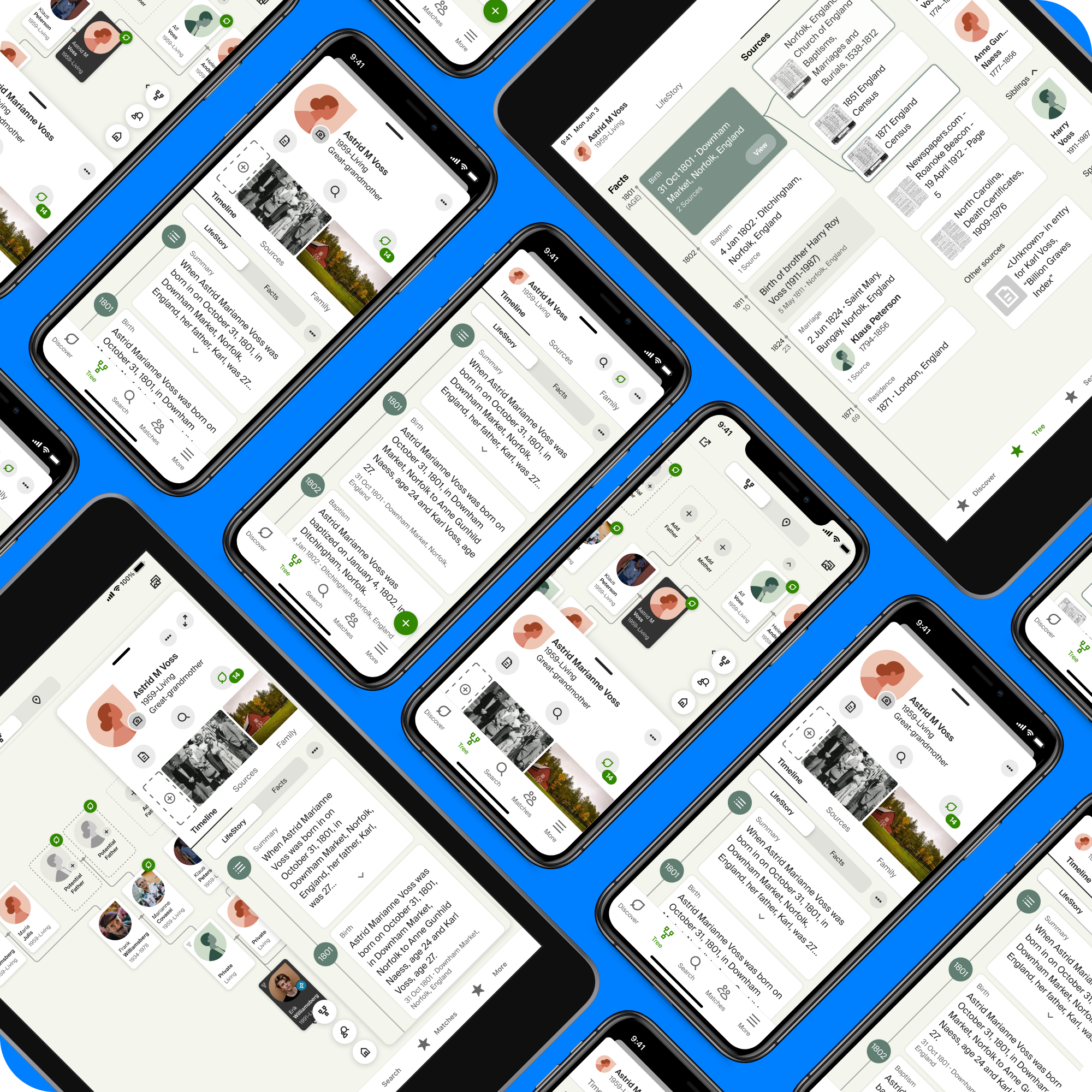
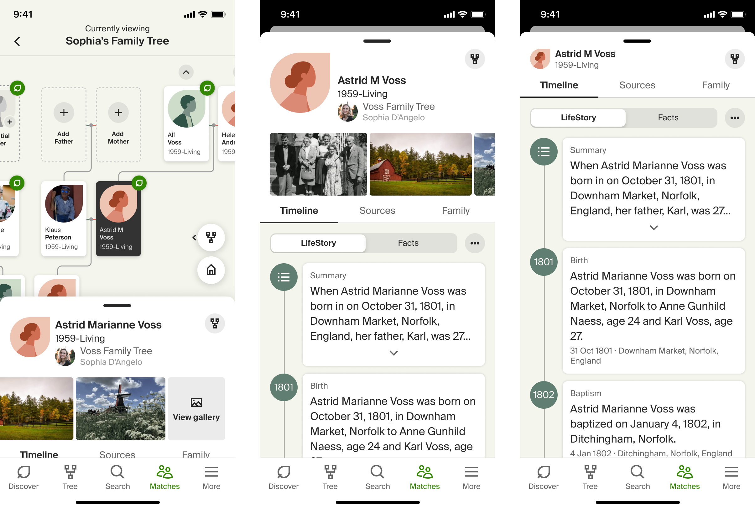
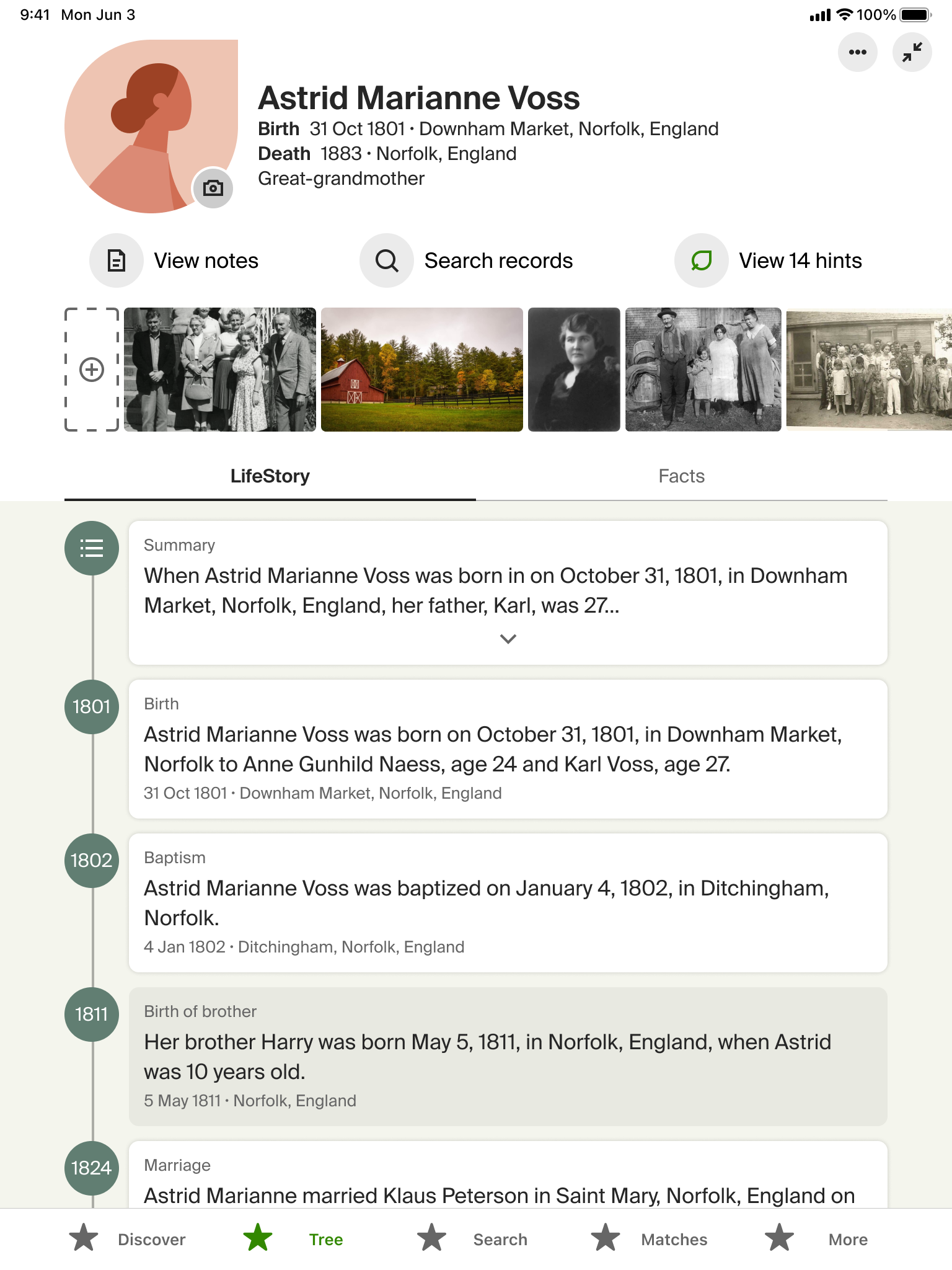
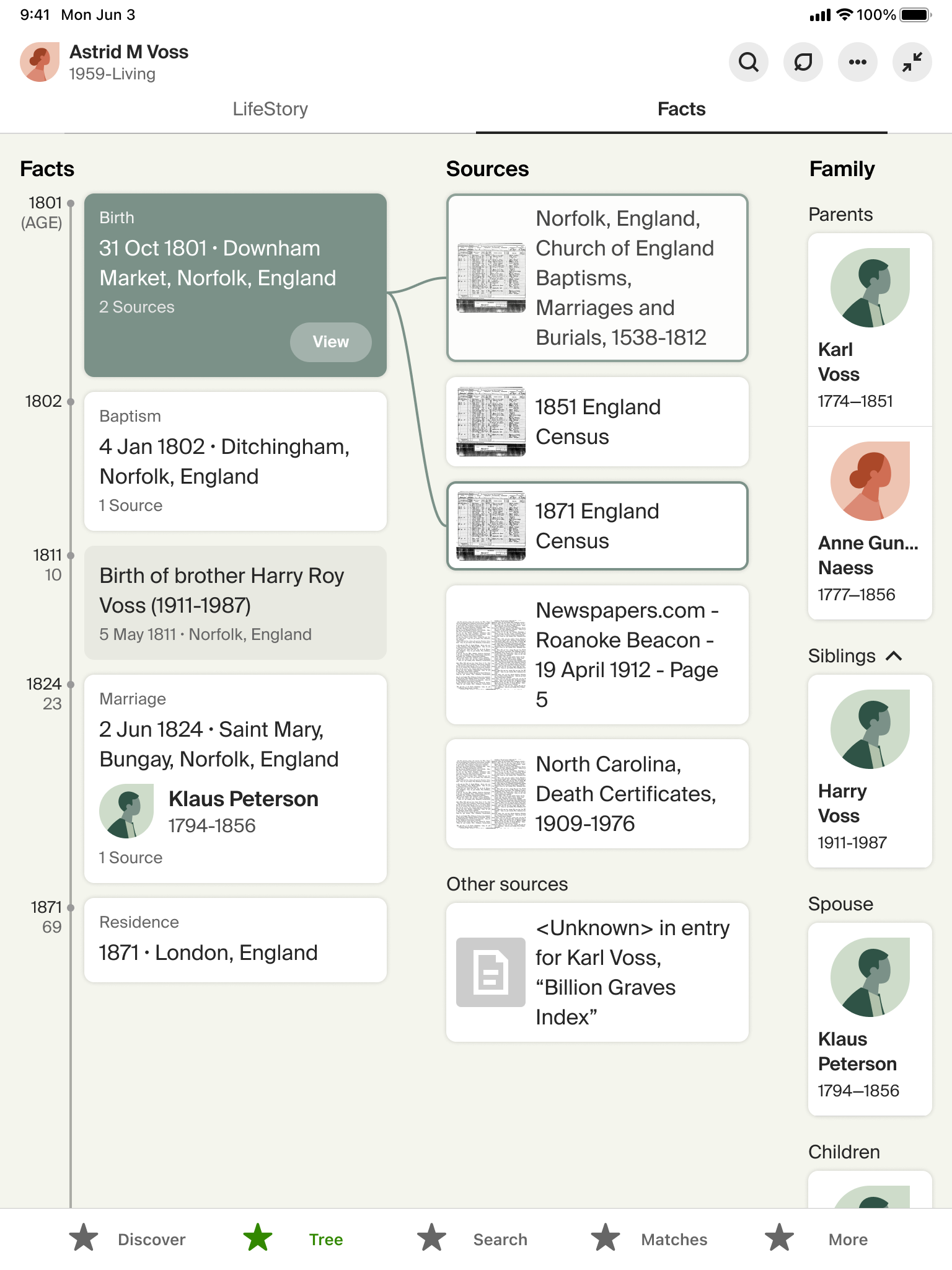
On the web we also have some nice functionality that shows how the various peice sof information are related. If you tap on an even in an ancestor's life timeline it will show what records you have that prove that. I wanted to bring that into the app experience as well.
I started with a floating sidebar to match the utility of the drawer we had created for the phone. The user can choose to jsut use the sidebar if they choose, but if they want to really see everything I added the ability to expand the sidebar to a fullscreen view.
The outcomes…
The intial impressions from user testing have been very favorable. Users are excited to see the changes and the new functionality. We are implementing this currently so the full experience isn't out, yet. But the parts that are have done very well.
We feel like we have a solid base to continue to evolve the person page going forward. We are currently evaluating ways that we can integrate DNA more and looking to expand the functionality further as well.

Selected Works